RedFest 2026 Winner
SYRIOS · UH UX Lab
Testing a 2,000-year-old story with 11 real people.
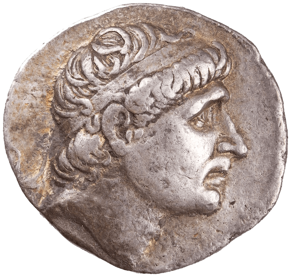
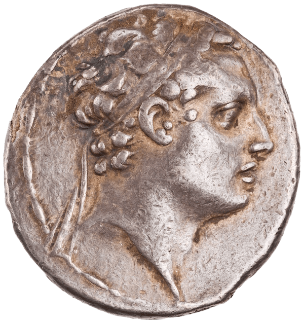
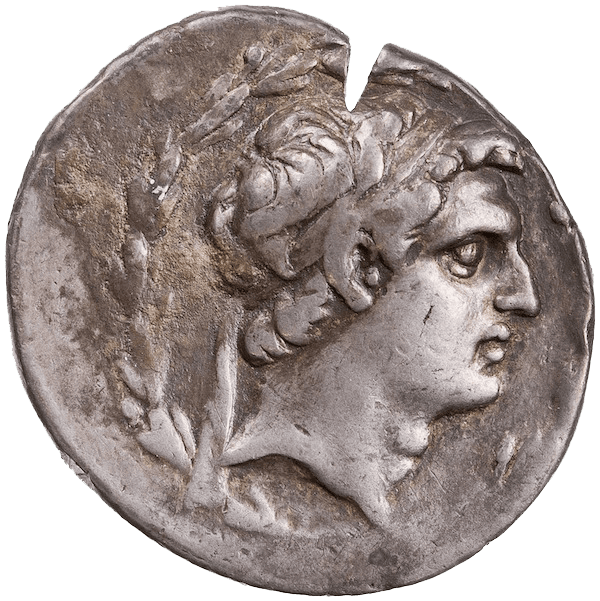
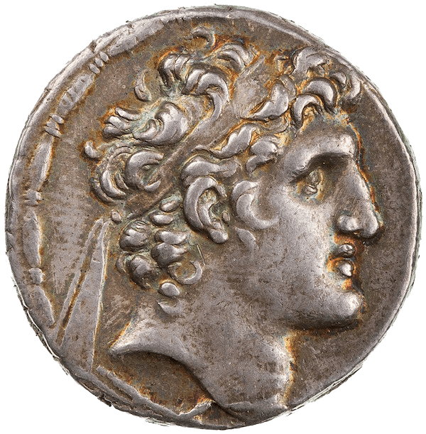
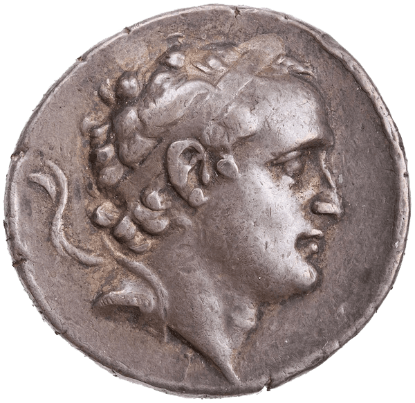
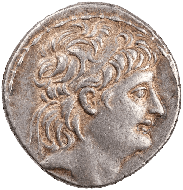
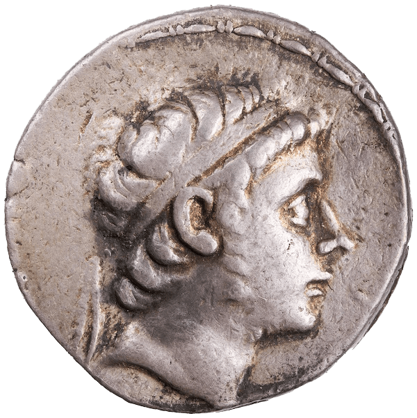
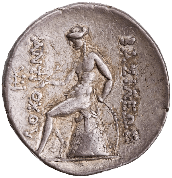
SYRIOS is a digital humanities project about the coins of ancient Syria. Its team built an interactive timeline in ClioVis and needed to know if people could actually use it. We ran moderated usability tests across 7 audience types, and the study won first place at RedFest 2026.
Background
A timeline full of kings, events and coins, never tested with real people.
Before investing more, the team needed to know where people got stuck, and if ClioVis worked better for building content or for showing it.
Can students, teachers and experts find their way through 300 years of coins?
Method
11 testers, 7 audience types, 10 tasks each.
We timed every task, noted what people did and said, and had them rate each task and the whole system.
- K-12 teacher ×3
- High school student ×2
- Middle school student
- Museum professional
- Hobbyist ×2
- Historian
- Subject matter expert
Findings
Four places people got lost.
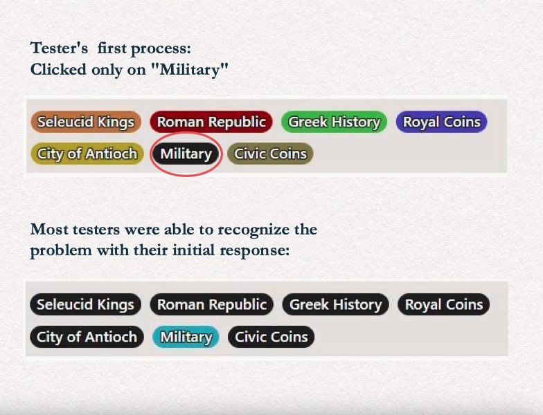
01 · The biggest issue
Filtering worked backwards.
Everyone clicked "Military" to see military events. Instead, clicking hides a category. It was the hardest, slowest task of all: 4.0 ease, about 77 seconds.
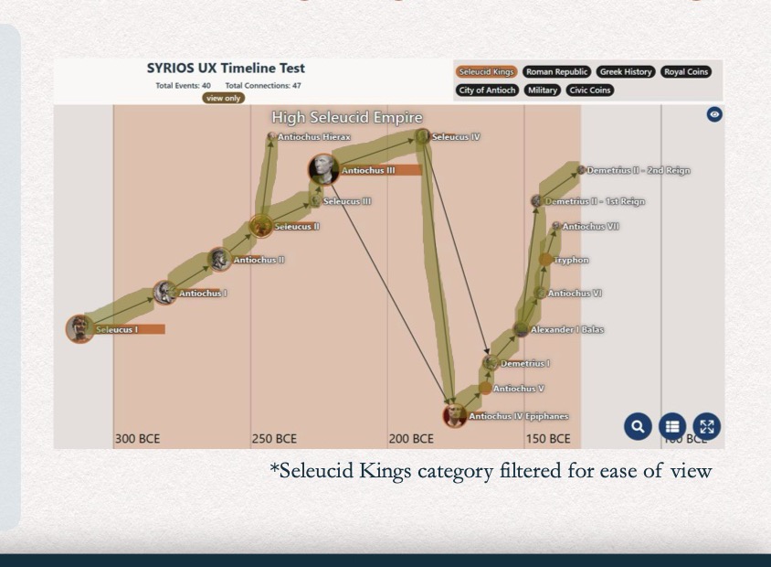
02
Connections between kings were hard to follow.
Colors, arrows and crowded areas made people guess instead of following the line with confidence.
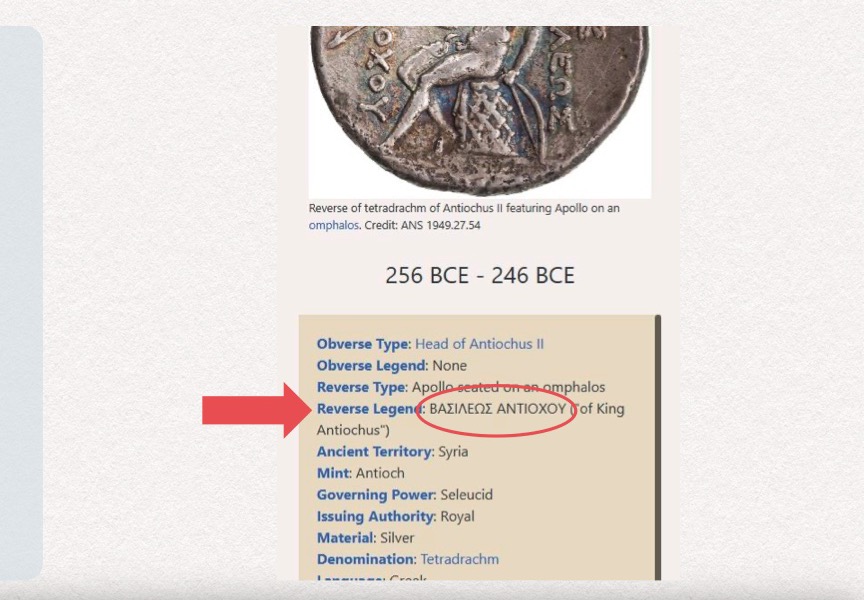
03
Coin details hid behind jargon.
"Reverse Legend" meant little to non-experts, and the glossary opened in a new tab, pulling people out of the timeline.
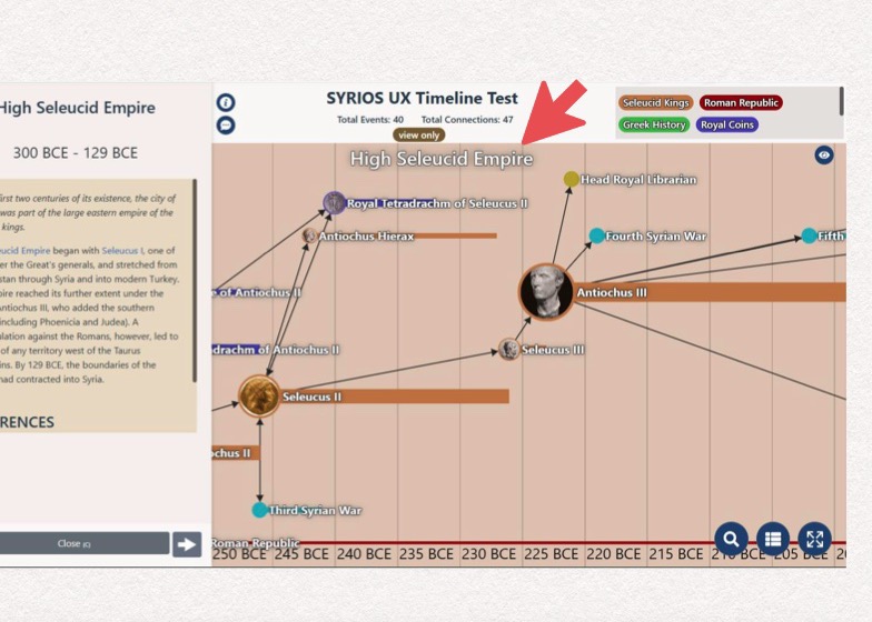
04
Clickable things didn't look clickable.
Testers missed that the era title card opens a description, and many never zoomed in.
"It's just kind of backwards from what you would hope."Subject matter expert, on filtering
Results
Above-average usability, with clear weak spots.
SUS score by tester
- T1
- T2
- T3
- T4
- T5
- T6
- T7
- T8
- T9
- T10
- T11
Time on task (seconds, approx.)
- Q1
- Q2
- Q3
- Q4
- Q5
- Q6
- Q7
- Q8
- Q9
- Q10
"Overall, it's pretty intuitive."Museum professional
"Looking for the precise number is very difficult."K-12 teacher
Recommendations
Five changes to make the timeline harder to get lost in.
- A "how to" guideA short pop-up the first time someone arrives.
- Round coin iconsSo coins stand out from events at a glance.
- Limit zoom-outKeep the view where the events are.
- A legendShapes and colors explained in one place.
- "Reset view"A way back when people get lost.
Contact
Let's Work Together!
Currently open to work together
Connect on socials